
Marketing website · Landing page
Kodo website
The marketing site for Kodo, a B2B platform that turns the data two business partners share into one health score, hidden revenue and early warnings. I was Head of UX at Kodo, and building the product was my main focus. Alongside it, I designed the landing page that went live in 2023: the layout, the illustrations and the product visuals that explain what the platform does.
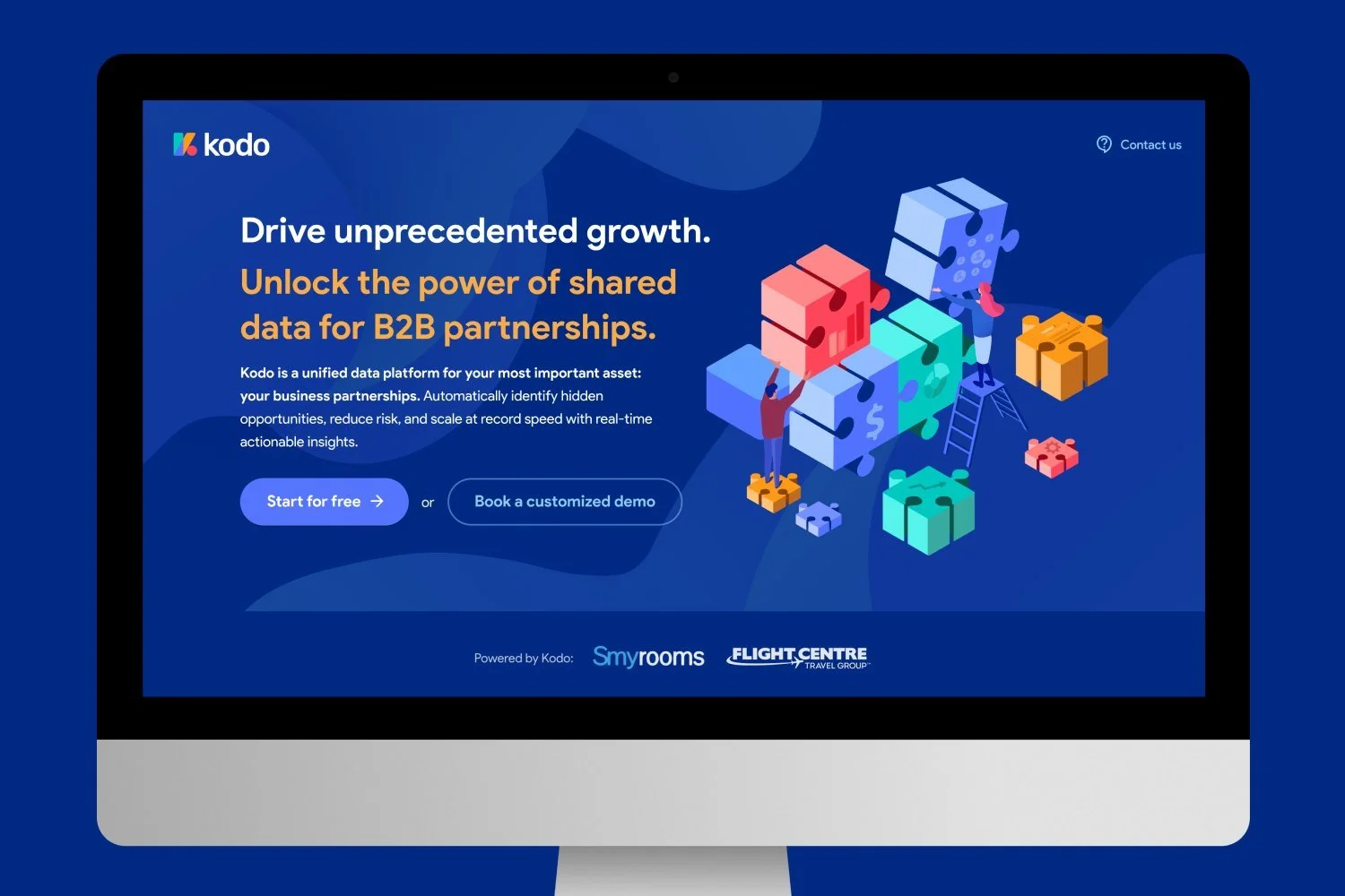
The brief
Kodo gives companies that sell through each other one shared view of their data: how healthy the partnership is, where revenue is slipping through, which risks are building up, and what to do next. It was a new kind of tool, neither a BI dashboard nor a CRM, so the site had to explain the idea before it could sell it.
The page leads with one promise and two ways in, start free or book a demo, then walks through the platform one feature at a time and ends on how easy it is to get started.

Showing the product without real data
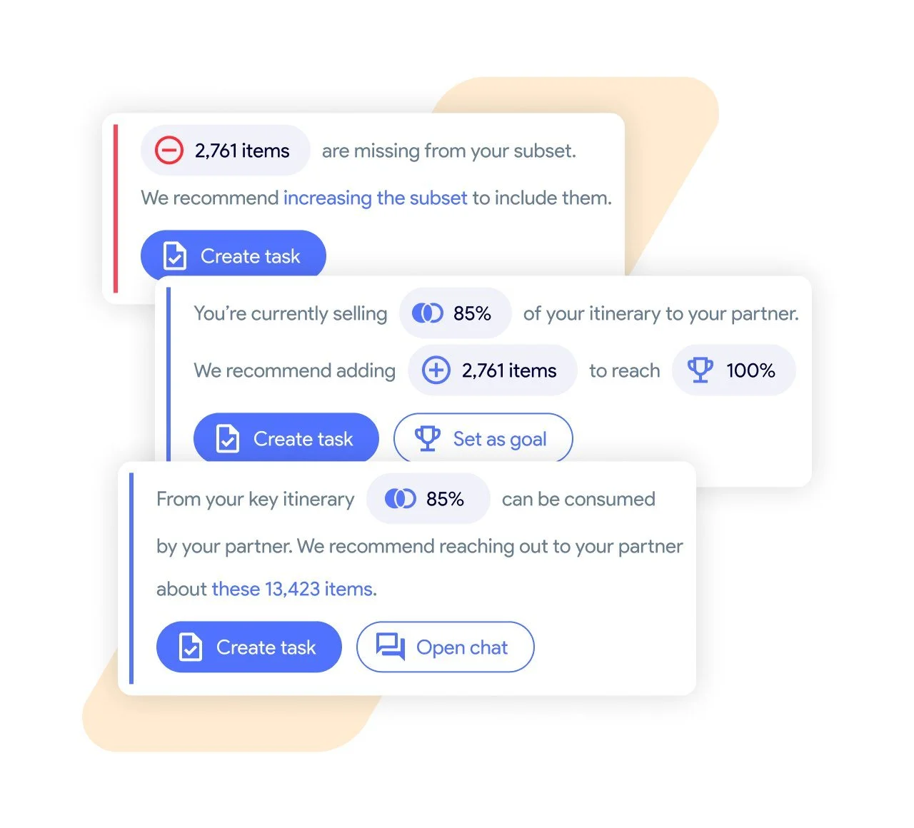
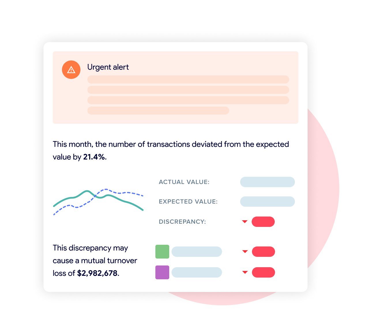
We couldn't use screenshots, because every screen in Kodo showed real customer data. Instead, I drew stylized versions of the product from scratch, based on the patterns I had designed for the platform itself: the health-score gauge, scores per area, alerts, suggested tasks and partner chat. The numbers are made up but plausible, grey bars stand in wherever real names or figures would have been, and a soft shape in the brand colors behind each card carries the palette down the page.
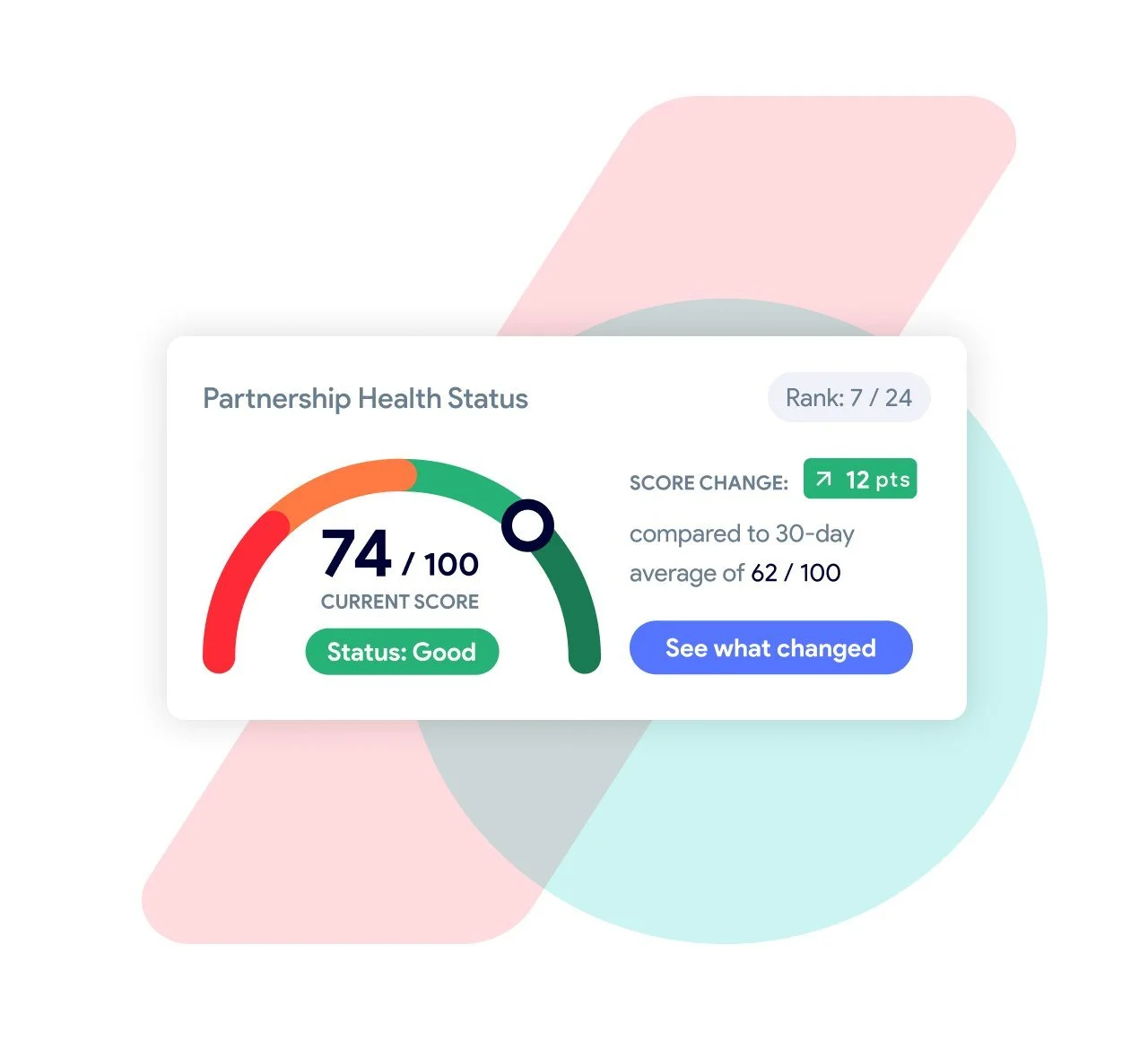
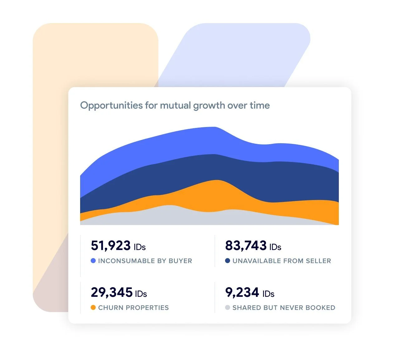
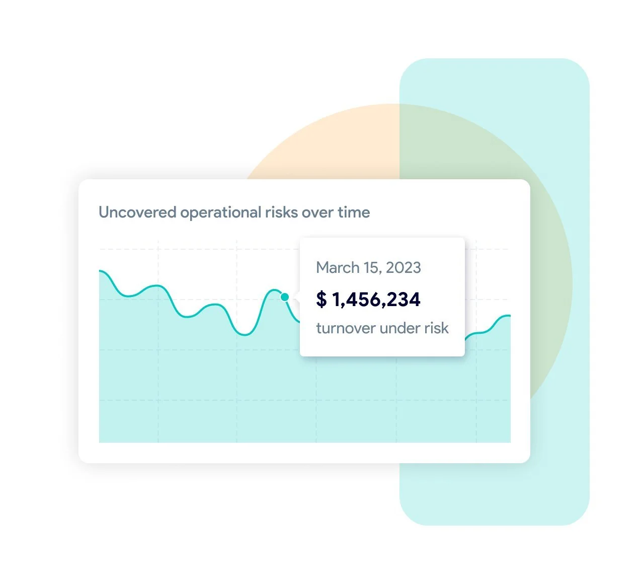


Illustrations: stock, made to fit
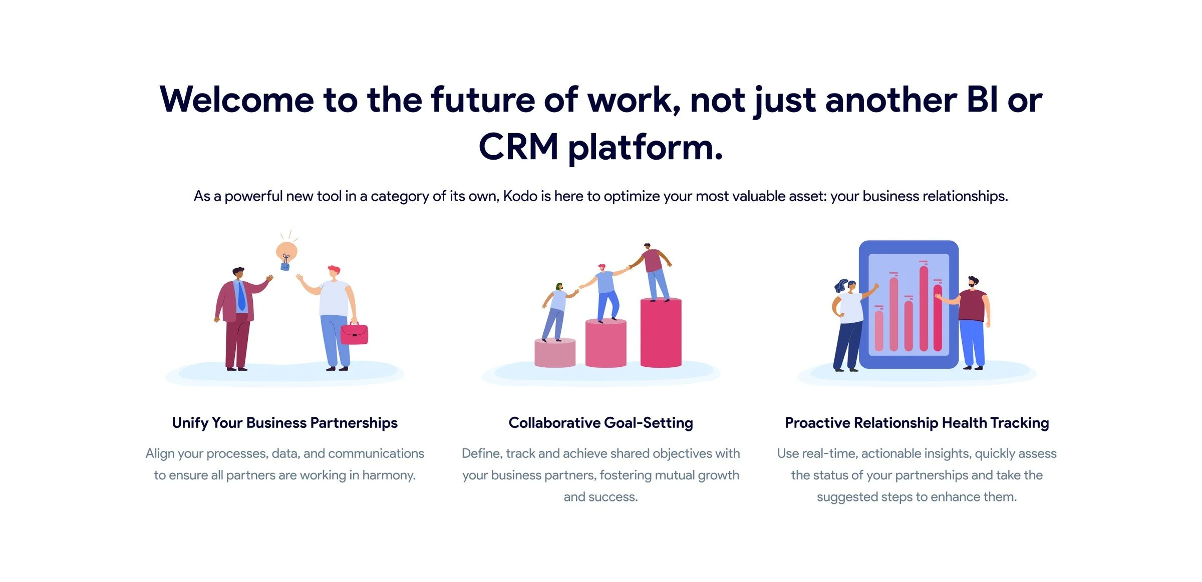
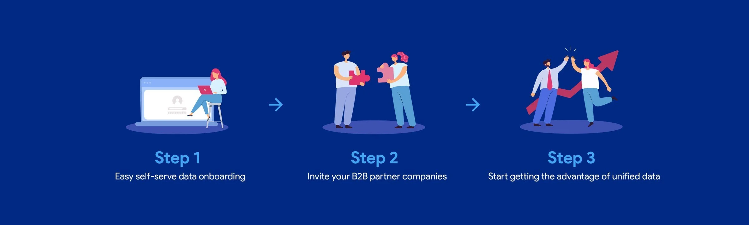
The people and the puzzle blocks started as stock illustrations. I recolored them to Kodo's palette, redrew lines in Illustrator where a hand or a pose had to land somewhere else, and put them together into new scenes, like the hero's partners building one structure out of their data.
Proof and the last call
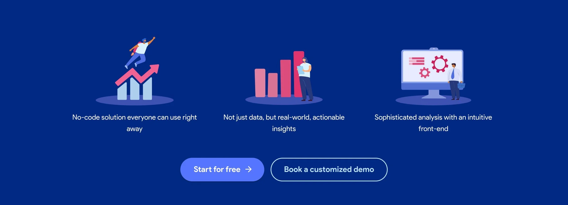
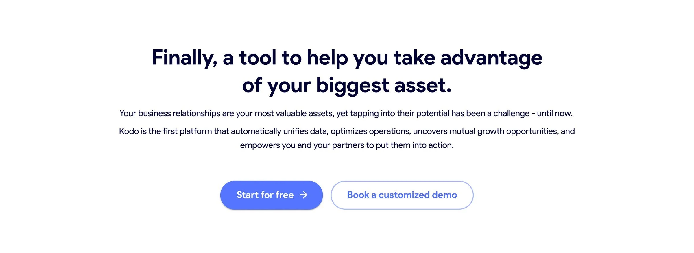
A customer's words break up the feature list, and the page closes by restating the problem in one sentence before offering both ways in one last time.

Outcome
The page went live on Kodo's site in 2023. Because I was designing the product at the same time, the site could show the platform as it really worked, down to the patterns, without showing a single customer's data.